ProjectTeam, Inc.
Redesigning a construction management software landing page for clarity, impact, and user-friendliness.

Project Type
Audit & Landing Page Design
Role
CRO Designer, Gartner
Tools
Instapage, Figma, Illustrator
Challenge
ProjectTeam, a construction management software vendor, wanted to boost visibility for their platform and increase the amount of buyers, but their existing landing page wasn't meeting their expectations.
Solution
To achieve their vision, I conducted a data-driven analysis on high-converting landing pages in the project management category. By implementing the trends of top-performing pages, and adhering to best practices and brand standards, I crafted a conversion-boosting redesign.
Category Analysis & Design
In analyzing the best performers in the project management category, I identified common trends in the layouts, style of copy, and other design elements which drove conversions.
KEY TRENDS Identified
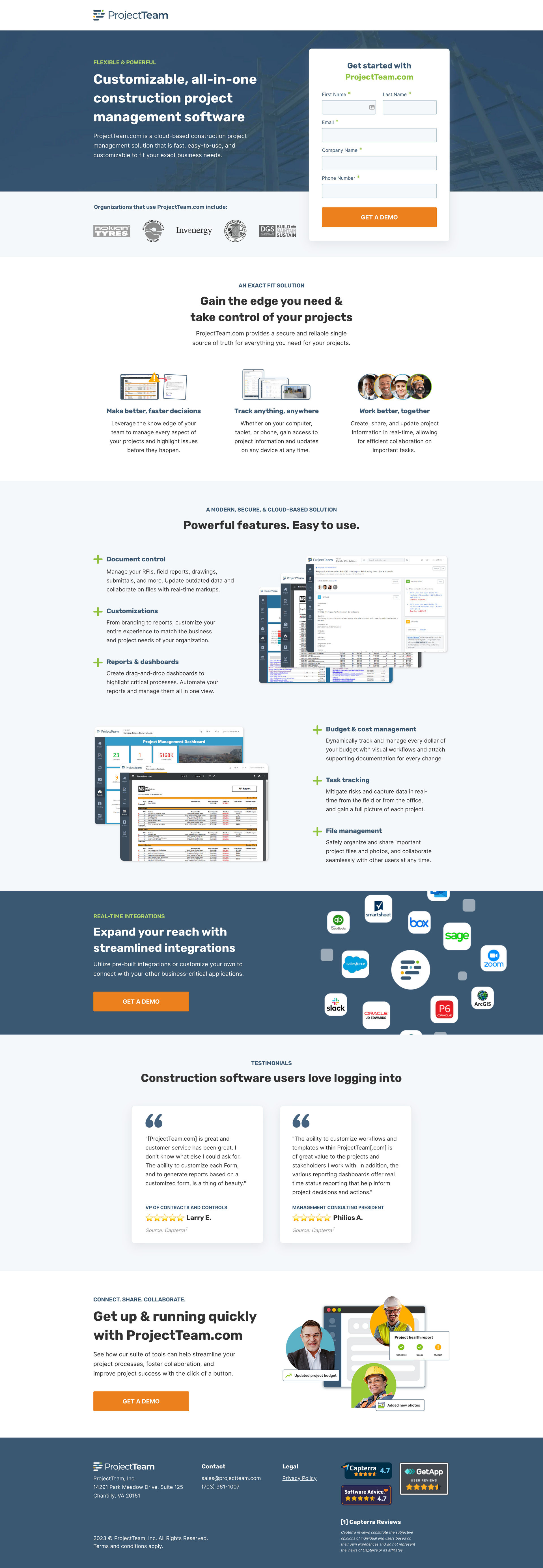
- Hero with Impact: Clear value propositions, the use of trust-building customer logos, and a readily accessible form above the fold grabbed attention and guided action.
- Benefit-First Focus: 3-4 key benefits summarizing the value-add of the product were most-often placed near the top of the page.
- Visual Storytelling: Eye-catching screenshots of the software in action were featured throughout successful pages.
- Integration Spotlight: A dedicated section was usually seen highlighting the product's integration capabilities.
Design
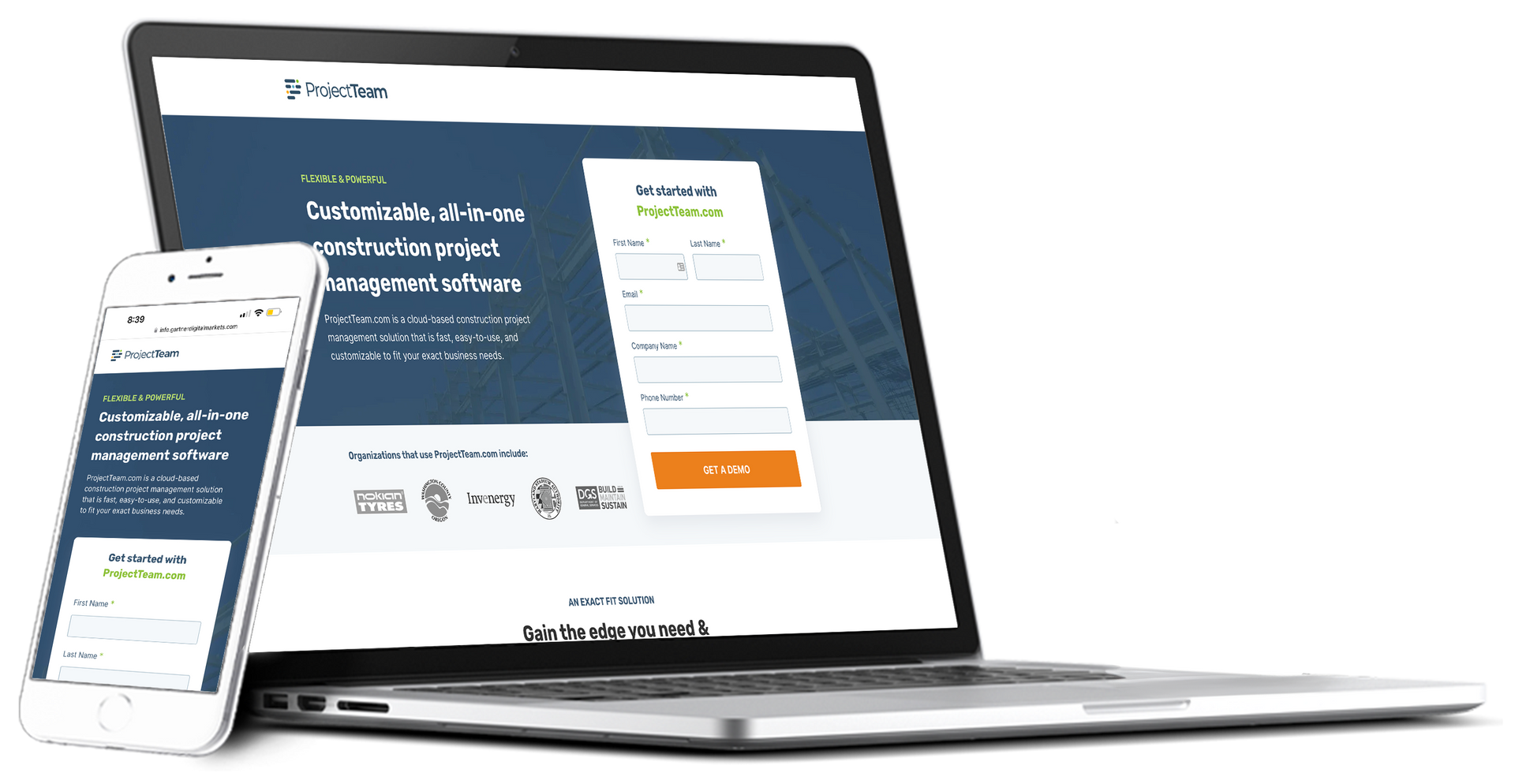
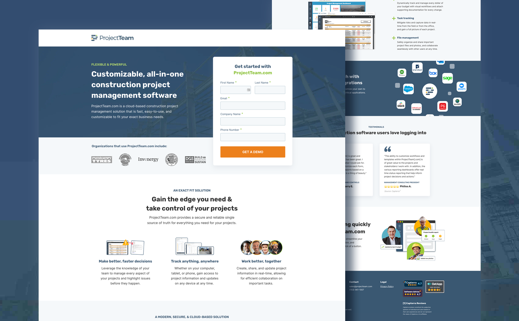
With key areas to improve identified and adhering to best practices, I created a wireframe to establish the basic page layout. Once the sections were arranged, I begin to apply ProjectTeam's branding.
I created a mini brand style guide based on their existing website branding. From their fonts (Rubik/Inter) and all image assets, to existing colors and element styling (eyebrow headlines and rounded button corners), I ensured I was creating a seamless customer journey from start to finish of the conversion process.
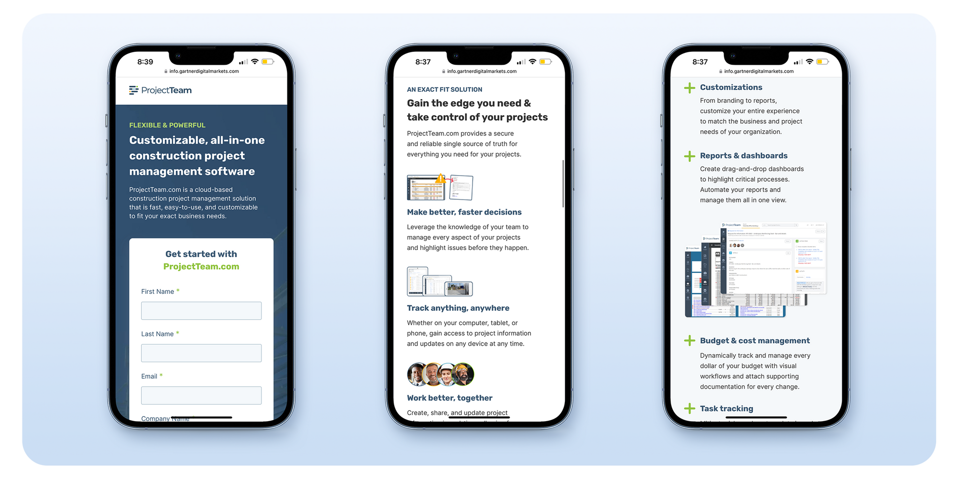
I sampled the orange in the existing design for use as a high-contrast color in their CTA, but adjusted the shade to comply with 508/A11y guidelines. For the copy, I made sure to include the same professional yet approachable tone of voice as they employed on their website. Finally, I optimized the page for a mobile audience, providing a consistent experience across all devices.
The page underwent an internal design and stakeholder review to gather feedback and finalize the design. Once complete, I reviewed the page with the point of contact at ProjectTeam, and received approval to go live.

Streamlining Leads: Optimizing with HubSpot
Beyond the visual makeover, we wanted to ensure a seamless journey for every click. Working alongside ProjectTeam's marketing team, we integrated HubSpot into the landing page.
Impact
- Centralized Lead Management: Automated workflows captured all conversions, providing a repository for efficient lead management.
- Campaign Clarity: Custom dashboards empowered ProjectTeam to make data-driven decisions and optimize their Capterra campaign.
- A Seamless Experience: From click to conversion, every interaction was smooth and efficient, creating a positive brand impression.
Results
ProjectTeam worked with their account manager to solidify a strategy for their new campaign while we monitored conversions over a 90-day period.
1.28% CVR (217 clicks)
Month 1
4.41% CVR (461 clicks)
Month 2
8.96% CVR (741 clicks)
Month 3
In Month 1, the conversion rate was well below the target threshold of 5%. While ProjectTeam's spending had increased exponentially in the time, they were targeting too wide a combination of categories and localities. In Month 2, however, after working with their account manager to refine their campaign, we saw over 200% growth in conversions.
Finally, in Month 3, the campaign strategy was in full swing—ProjectTeam saw their conversion rate more than double from the previous month, achieving a total of 600% growth over the 90 days they had been live.